One Stop Swap, Inc. Mobile App
Overview
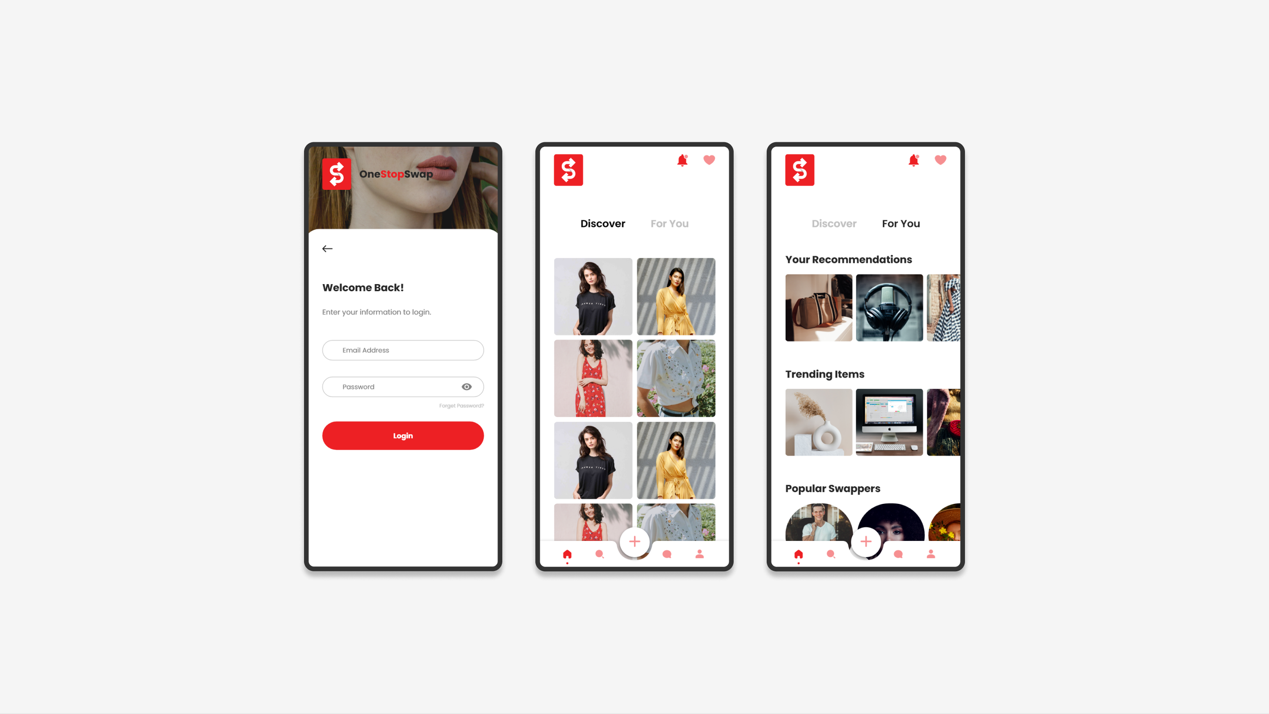
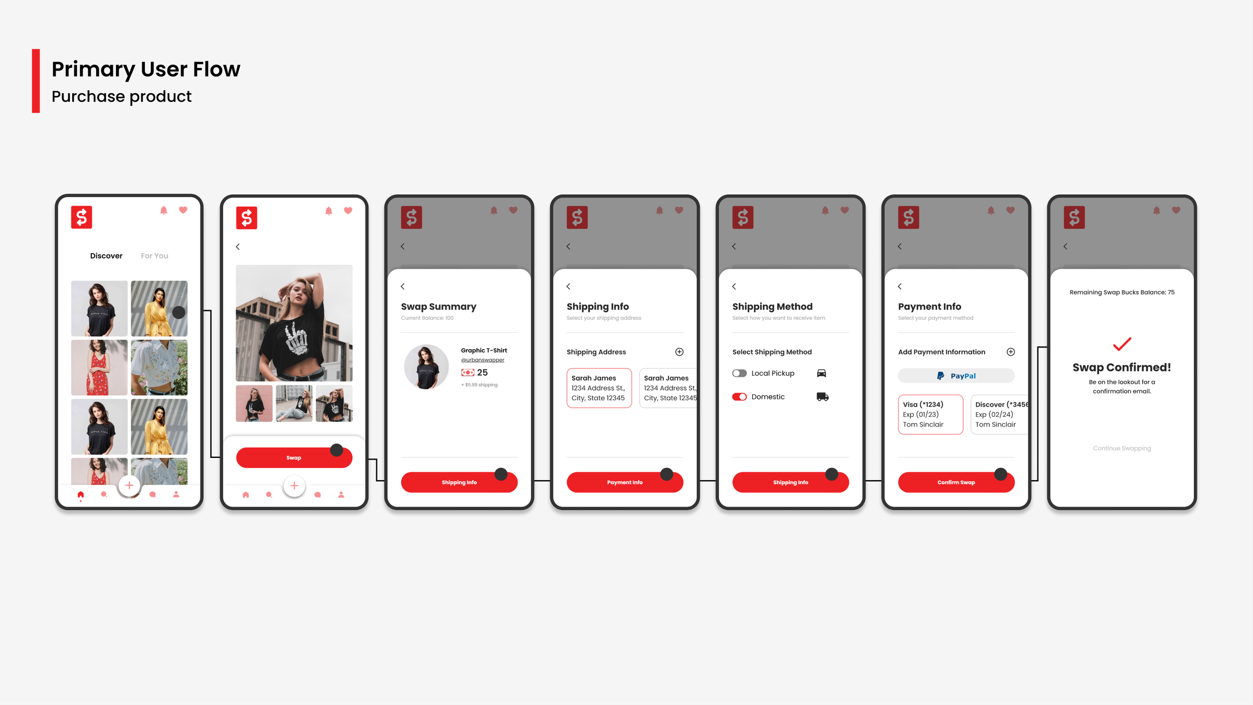
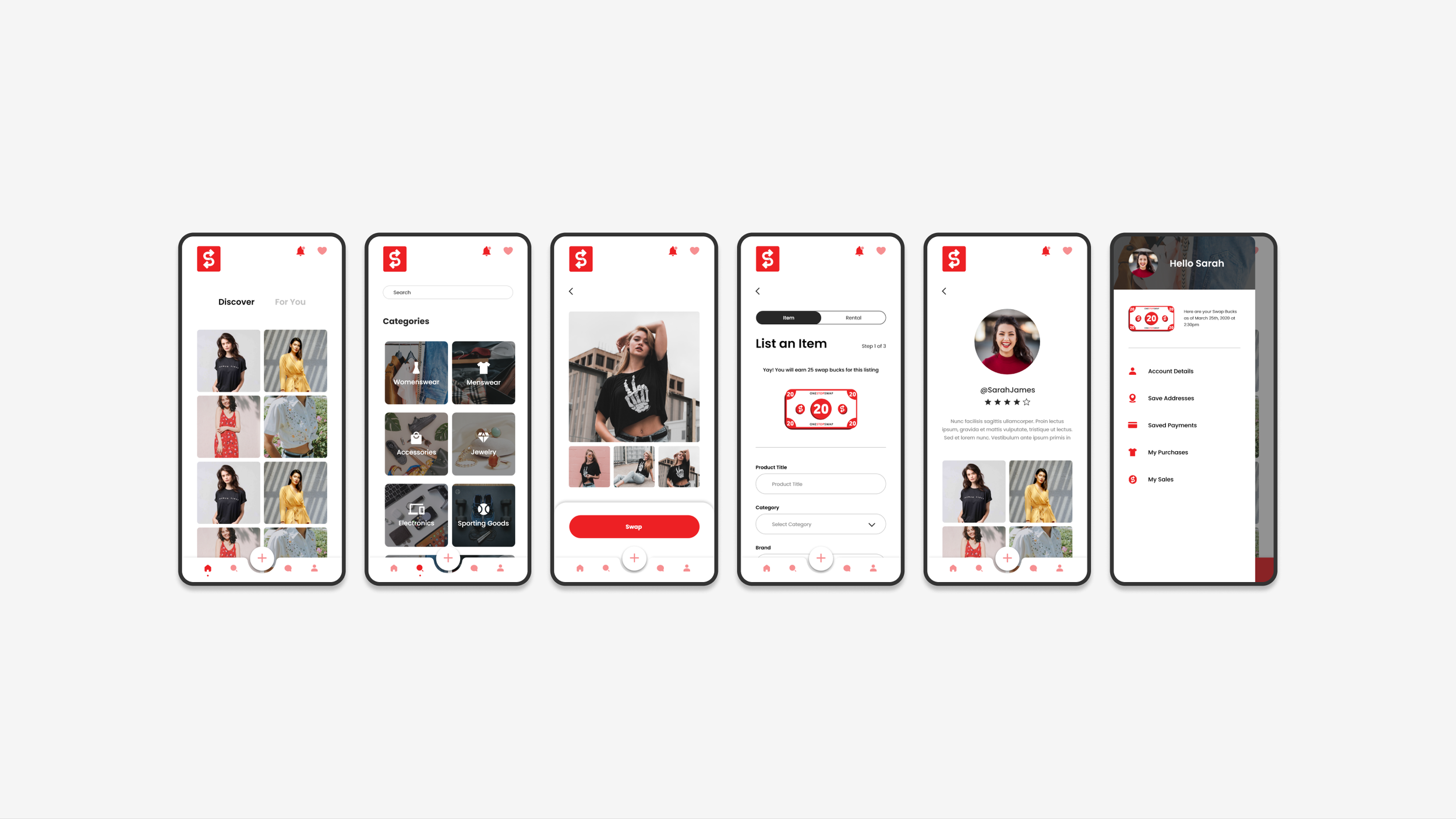
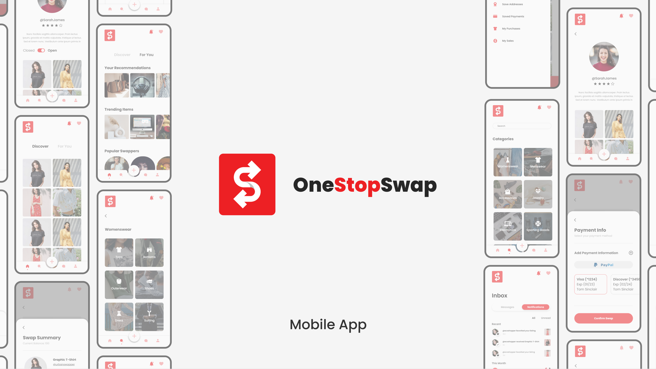
The objective of the project was to develop a mobile platform for the buying and selling of goods with real and unique currency. As a UX Designer, I collaborated with a Product Manager to design an intuitive user experience. My responsibilities included creating user flows, wireframing user journeys, and transforming wireframes into high-fidelity prototypes.
I leveraged Adobe XD for wireframing and prototyping, and Figma for user flow design. The project duration was 8 weeks, commencing in May.
Our Goal
To create a platform that allows users to search, list, and buy items using real or exclusive currency. We want to provide them with a easy and seamless way to sell and buy unwanted items. We hope that by providing a fun and easy way to list items, users will have more access and a different means to get rid of unwanted or old items without having to donate them or give them away.
Process
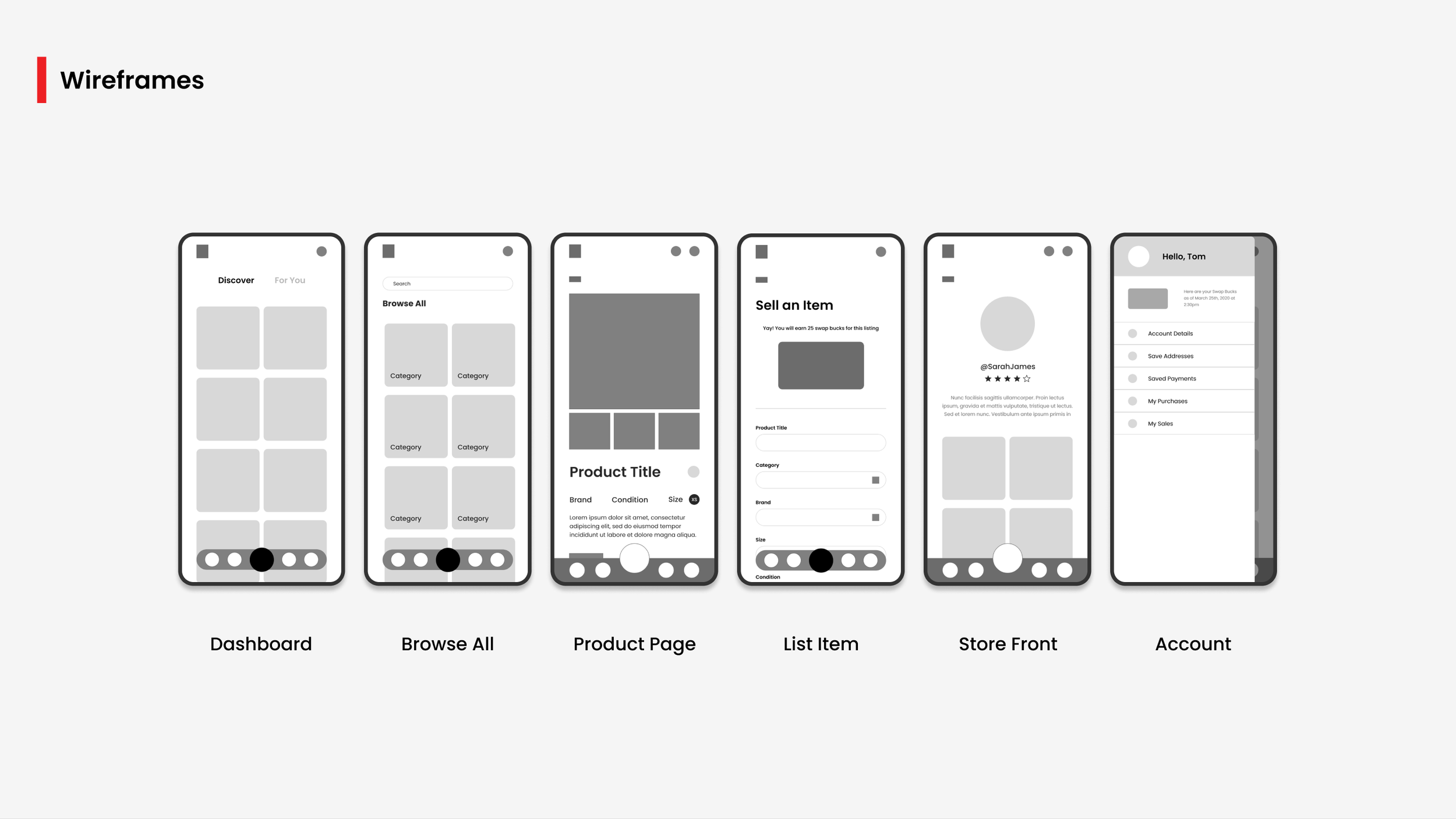
As a UX Designer, I was responsible for developing user flows, wireframes, and high-fidelity mockups for various pages of the app. I began each task by creating user flows, which provided me with a clear understanding of the pages required and the actions users would need to perform. After the user flows were approved, I created wireframes of each page according to the flow, making necessary modifications along the way. Finally, I transformed the wireframes into high-fidelity mockups. Throughout the process, I continuously refined my designs by revisiting past designs and making tweaks to improve the user experience. I collaborated directly with my Product Manager and received feedback from stakeholders, which led to further changes and additions.
Iterative Design
During the project, I encountered numerous instances where I had to revisit specific features or designs after their initial creation, either due to discrepancies or to explore alternative design options. For example, I optimized the tab bar menu, photo upload feature, and browse feature. Although these were minor components of the app, refining them significantly enhanced the overall user experience.
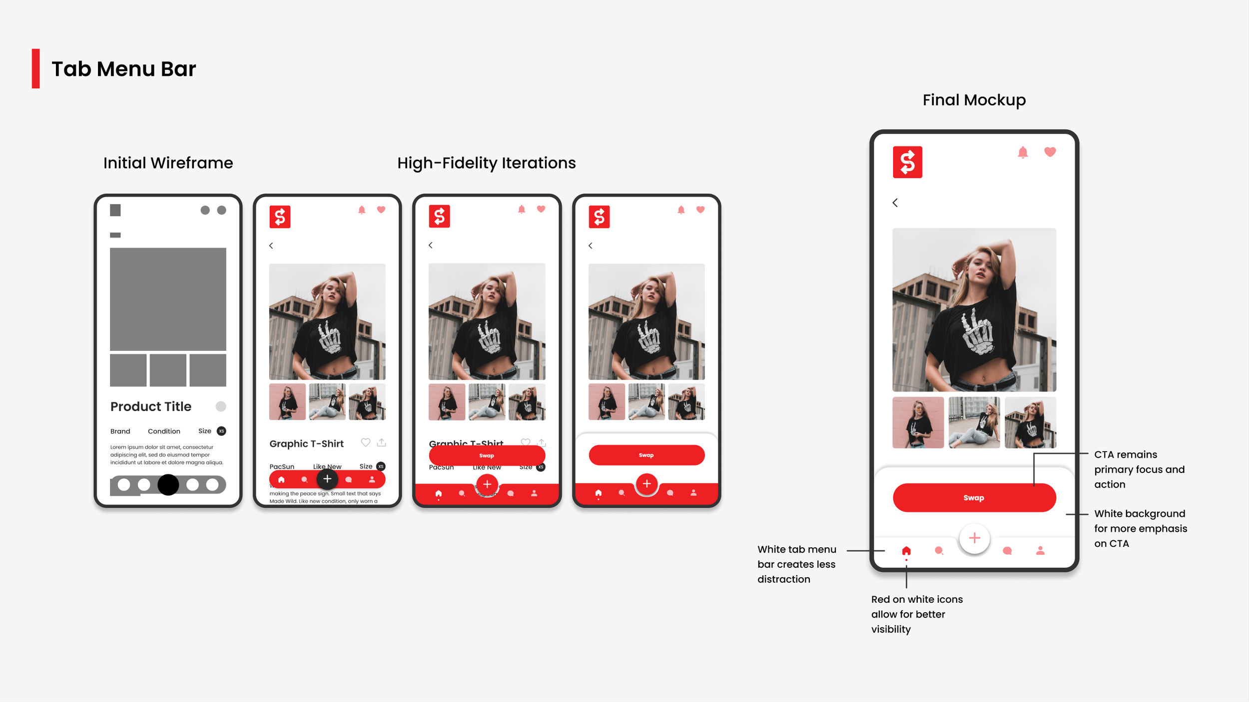
Tab Menu Bar
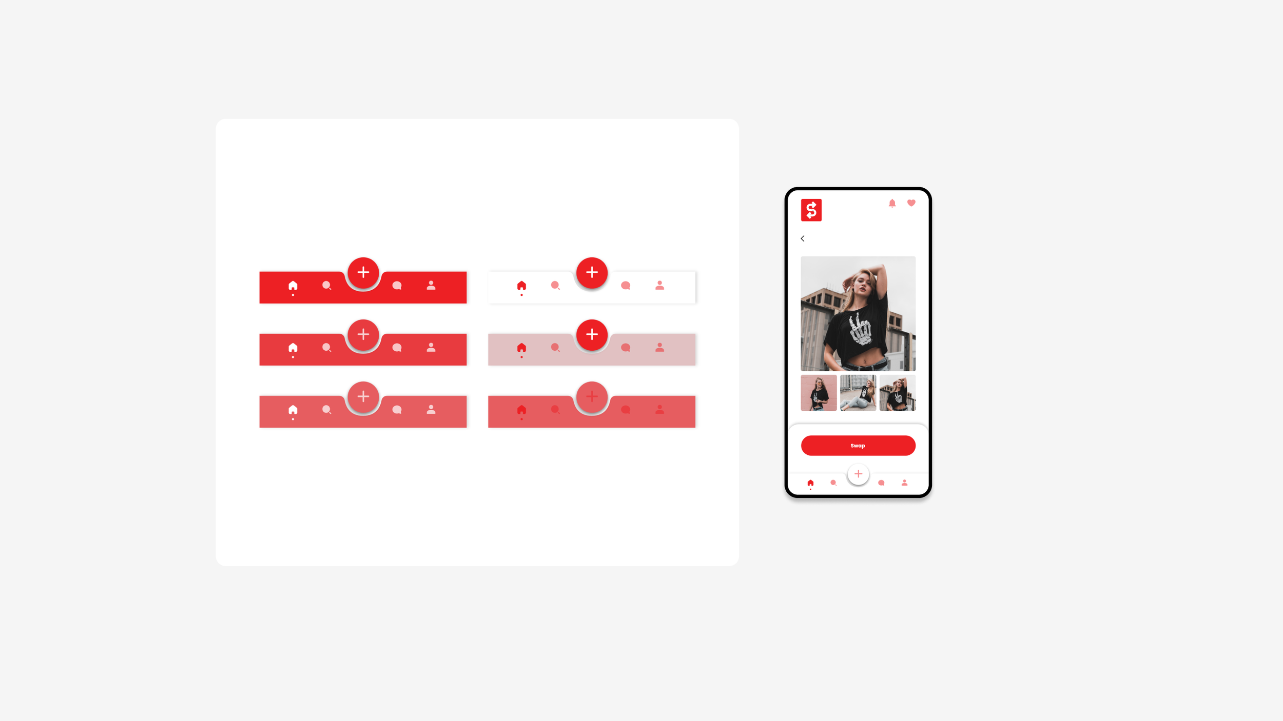
In designing the tab bar menu, we initially considered a floating bar approach. However, when the design was refined in high-fidelity, we found that the bar lacked visibility due to its color blending with the text and images behind it. To resolve this issue, we grounded the bar to the bottom of the page while preserving its color and the prominent button in the middle.
The swap button posed another challenge as it also blended with the background. After discussion with my manager, we decided on a white background for the CTA, which resolved the issue. However, the color of the tab menu bar and the CTA matched, leading to a distraction for users. To solve this, we experimented with different color combinations and eventually settled on a red on white tab menu that provided clear visibility of the icons while keeping the focus on the CTA.
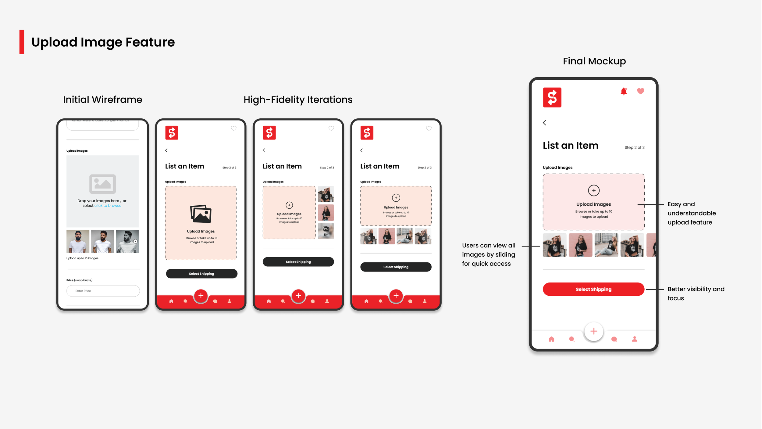
Upload Image Feature
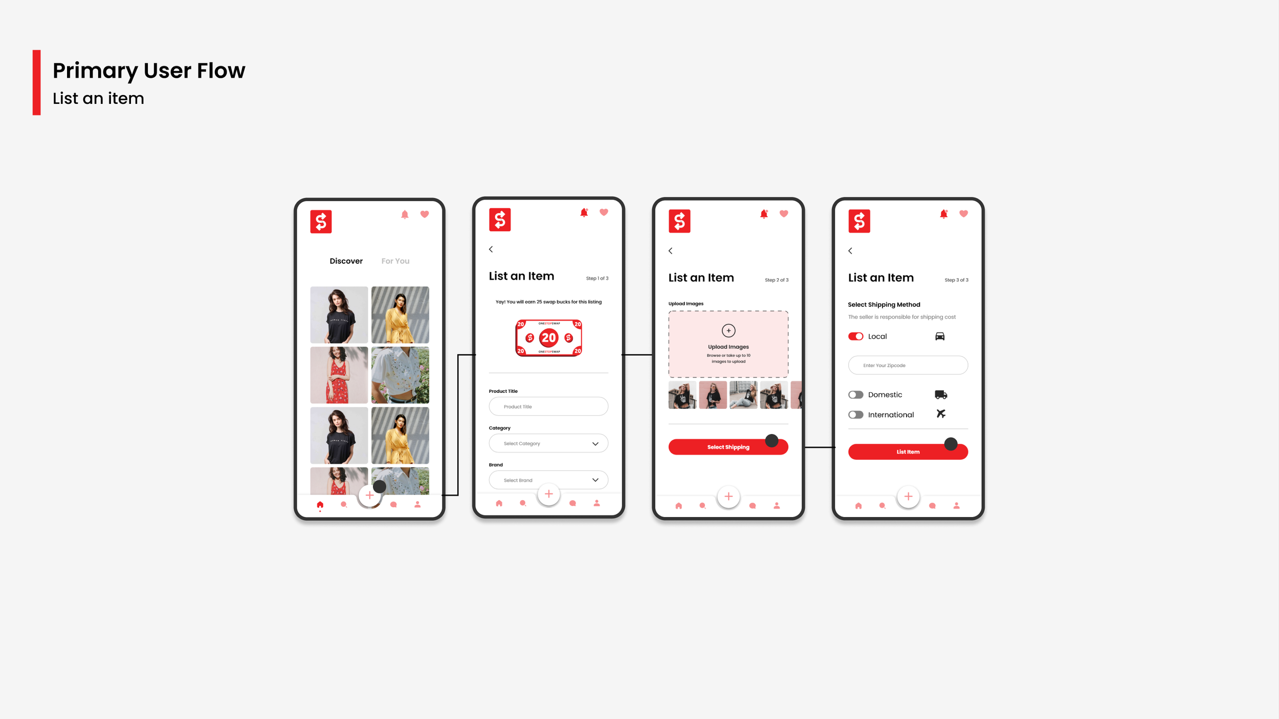
In the "Upload Image" feature, we aimed to simplify the design to align with the brand and colors. However, the design lacked the ability to view previously uploaded images and took up too much space. I revised the design to bring back viewable images in a square shape, saving screen space and making it easier for users to navigate through their photos with a swipe instead of clicking.
Browse Feature
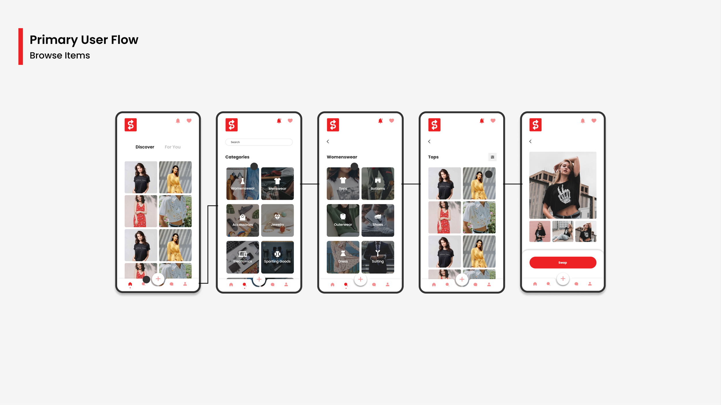
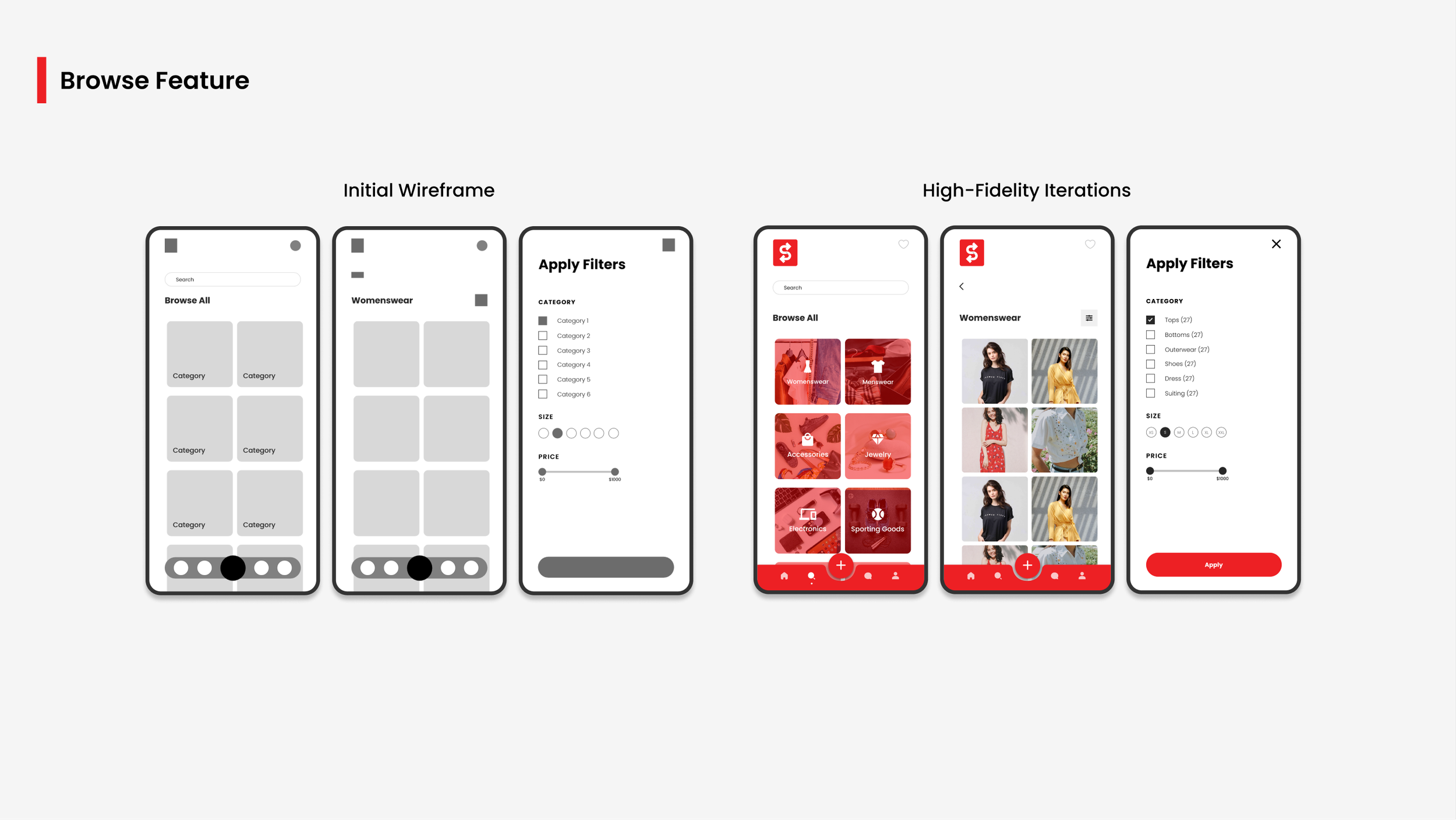
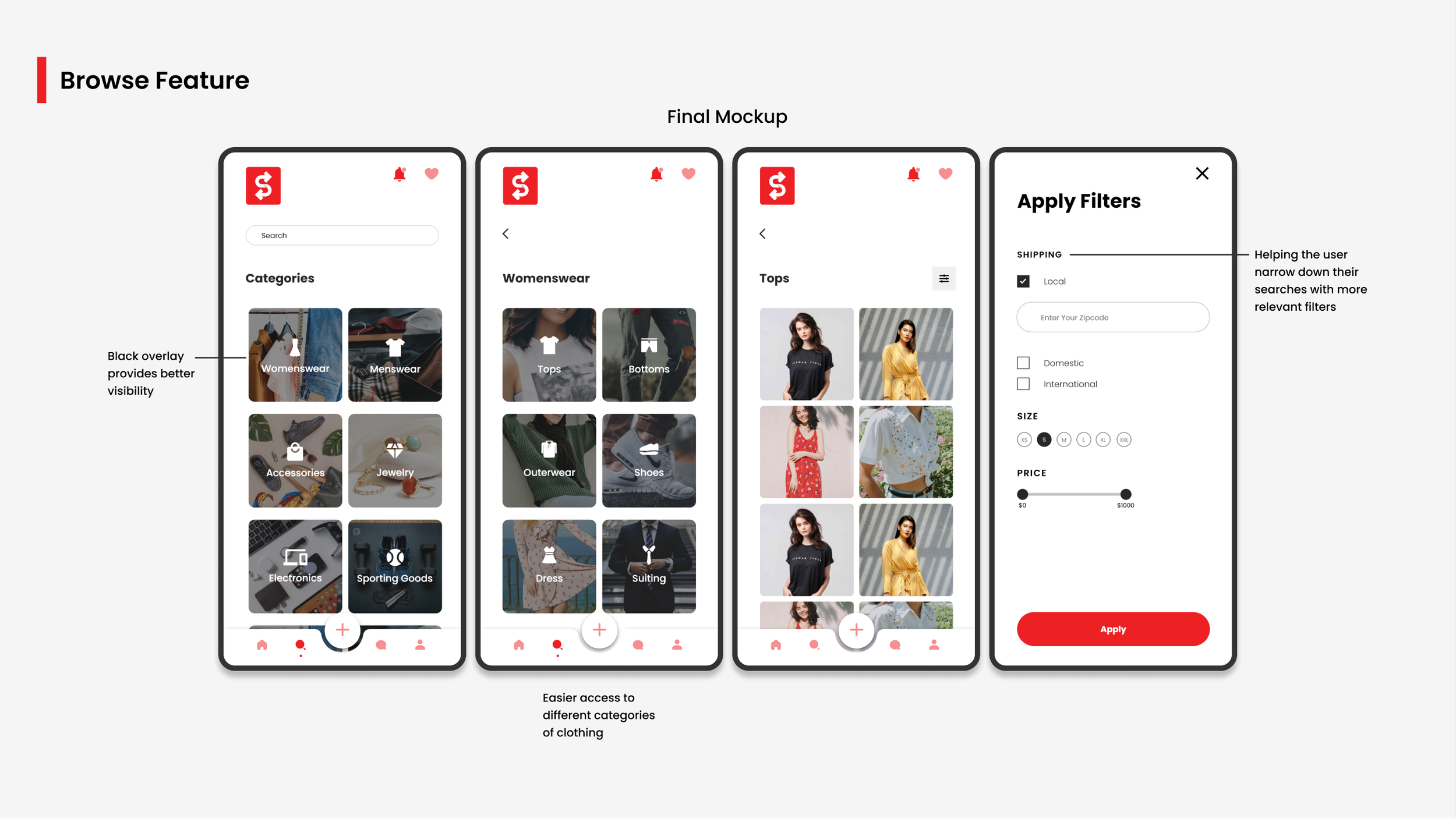
In the "Browse Items Flow," we added another page for users to select specific items within a category, reducing the number of clicks and allowing users to find the products they wanted more easily. The change also improved visibility by changing the color of the categories from red to black.
Results
The success of the project will be evaluated once the app is live, through user interactions and return rate.
Takeaways and Improvements
The lack of live audience testing made it challenging to assess the efficacy of the final designs. However, close collaboration with the product manager and stakeholders provided valuable feedback and opportunities for faster iterations.
Despite the challenges in generating ideas and designs, the experience was ultimately rewarding upon project completion.
Time constraints limited the amount of research conducted, which could have offered deeper insights into certain design elements. Conducting more qualitative research in the future may provide a clearer understanding of the user's needs and preferences.
Was the Problem Solved?
Our goal is to continuously improve the user experience and eliminate potential obstacles in the "buy and sell" process. Although we can't eliminate all challenges, we can strive to minimize them by testing and iterating the designs.
