Role | Graphic Designer
Duration | Two Months
Tools | Adobe Illustrator, Adobe Lightroom, Squarespace
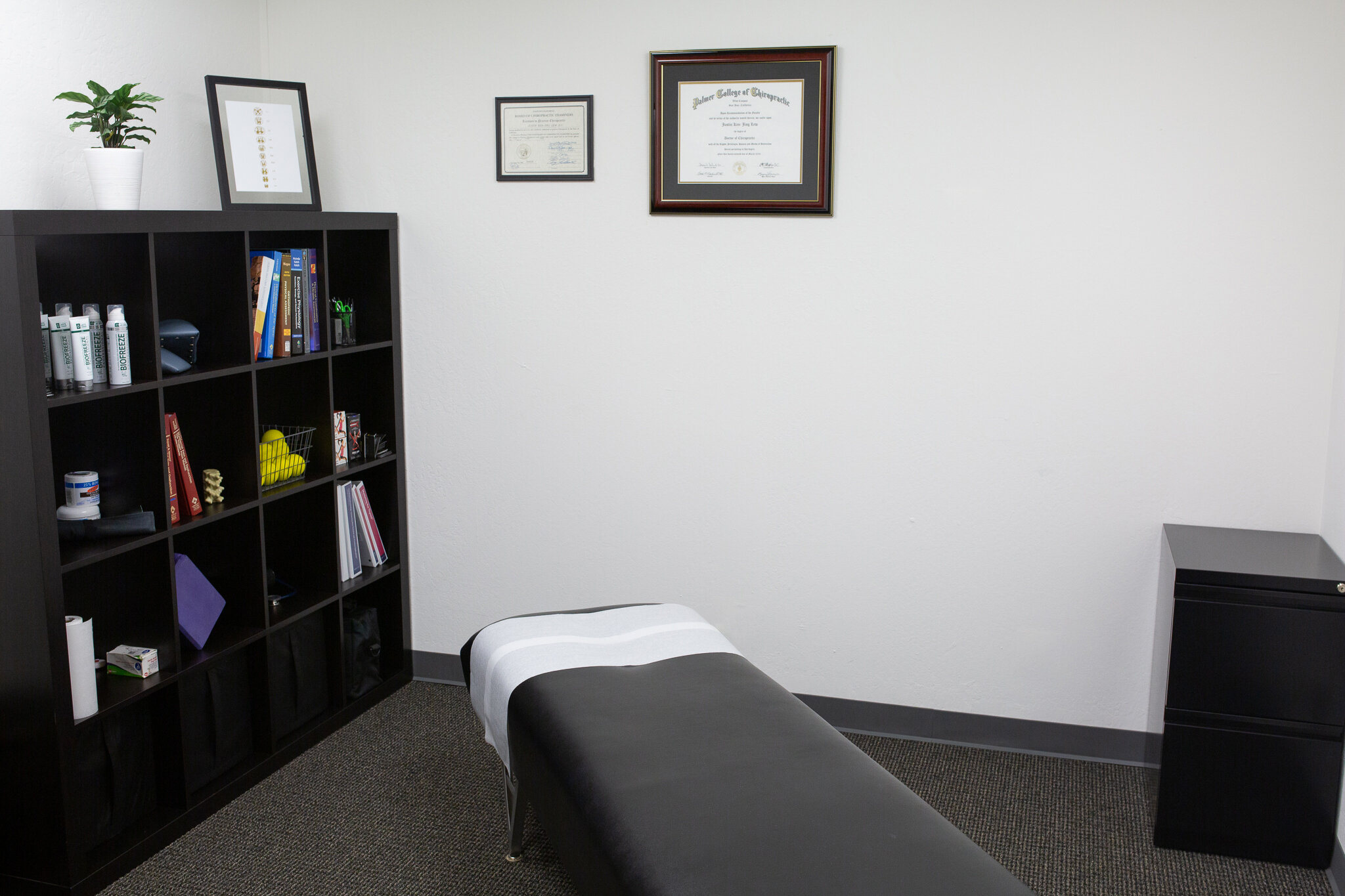
Symmetra is a Chiropractic business that not only provides customers with a treatment to their ailment but also an opportunity to learn and develop new exercise that can help maintain their health in the future. As the Graphic Designer, I was asked to design a logo for the brand and work on designing a website for the company. This included designing the site layout, creating small graphics, and working with a photographer to stage and take photos.
Check out the Symmetra’s site

Initial Designs
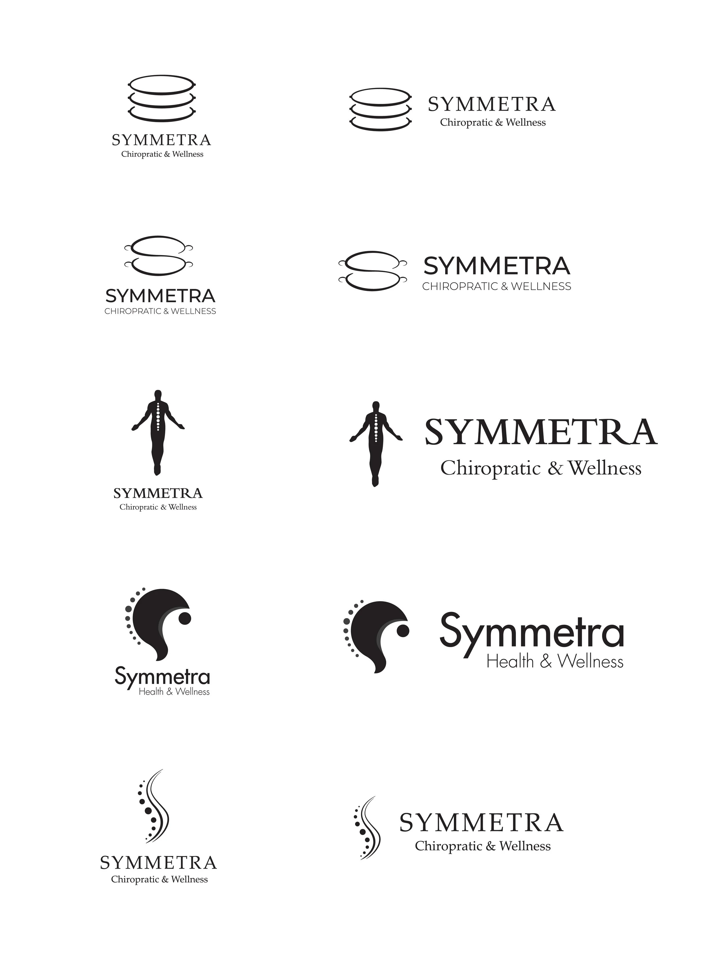
Through many sketches and ideas, I came up with some initial designs for Justin to look at. In my initial design process, I came up with as many designs as I could and took some of Justin’s wants as well into consideration. He wanted a logo that would allow customers to understand his business on first glance. Something recognizable but not overly complicated.

Logo Design Process
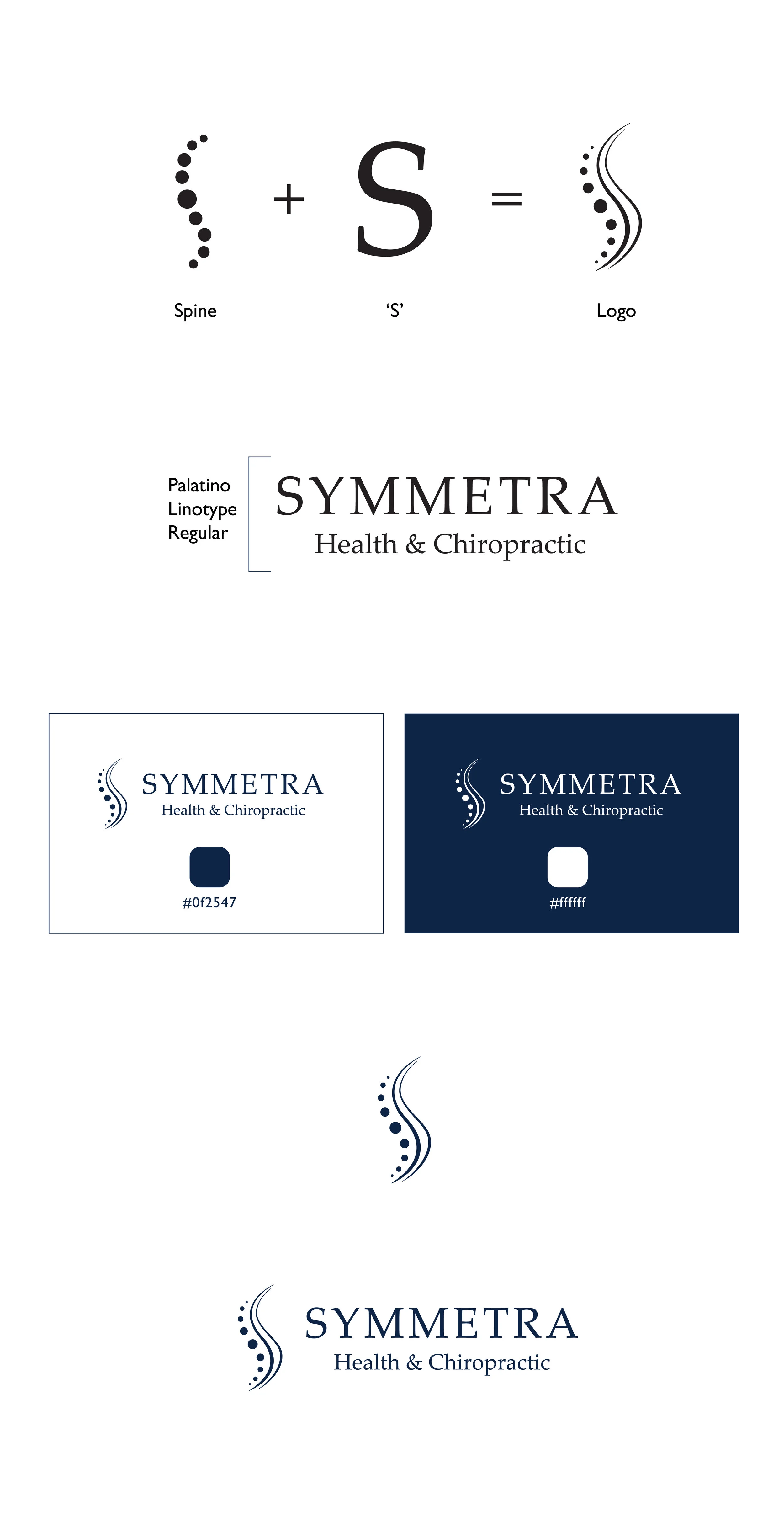
After talking with Justin and discussing his vision for the brand, I went with a design that would incorporate the ‘S’ in Symmetra and a spine. Simplifying a complex structure like the spine into circles and lines allowed for a simple yet still understandable logo. The font was chosen to convey professionalism in the business while maintaining legibility. The rigidness of the font also worked well in contrasting with the fluidness of the logo. The color chosen was intended for a cool and calm feel yet deep enough to provide a sense of expertise in this field. The lines on the logo represent the vertebra and the spinal cord while the circles represented the back bones.

Final Thoughts &
Reflection
I really enjoyed this process because it involved healthcare and fitness and trying to stay healthy and fit is a joy in my life. This project definitely had its ups and downs but overall, I was glad I could help Justin with starting his business pushing it in the right direction. Some take-aways for this project:
What went well? The process of coming up with some solid initial designs came out better than expected. Normally I would come up with a bunch of bad designs before landing on something good, but for this project, I felt that some of the initial designs worked well with the business and what their brand stood for.
What didn’t go well? Definitely working and designing the website was not as clean and easy as expect. It took many revisions and meetings to provide Justin with the website that he wanted. Even though the website is done, there are still changes I would want to make to continue to improve on the consistency of the brand and improve on the user experience.
What could be better? Even though I am satisfied with the logo outcome, I believe that the design can be more unified in the look and feel. I also think there needs to be more added for the style guide in the future to help keep Justin’s brand professional and consistent moving forward.
Symmetra’s goal of helping those learn to help themselves is something I believe is invaluable to many and being able to help Justin work towards his vision of doing that has been a fulfilling experience.


