Finding Professional Help Anywhere
Role | UX Designer
Duration | Four Months
Tools | Adobe XD, Adobe Illustrator, Adobe Photoshop
The first project for my CareerFoundry UX Design course was an app which allowed anyone to find professional help. This would provide reliable and easy access to knowledgeable and experience experts in their respective field. In the project, I focused on the function of finding and booking an appointment with a expert using a mobile app.
User Research
& User Persona
Finding help can be hard these days. Finding people that know how to even help you and your specific problem can be even more difficult. Not everyone knows how to change their pipes or where to get someone to help them with that. Equipt was designed to provide a platform for everyday people to find experts who are reliable, knowledgeable, and helpful.
Problem Statement
Life can be challenging sometimes and users may not always have the answer to their problems. Our users need a way to efficiently access a vast network of reliable professionals in their respective fields for assistance in their daily lives. We will know this to be true when we see how many users return to Equipt for our professional assistance and advice.
Research Goals
Identify key demographics of the potential users of the app to help me build the user persona
Identify users goals and usage when interacting with similar apps
Identify user pain points with their current expert apps or similar products
Collect data to determine what could potentially draw in users to use expert apps more consistently
I started this project off with conducting user surveys. I asked 10 questions and received 11 participants over the span of 1 day using Survey Monkey. These questions asked would provide insight on the users experience with similar apps and their behaviors. Conducting user surveys provided me with quantitative data since I was able to find people who were willing to participate. But to get more qualitative data, I conducted user interviews. This provided me with more focus data from open-ended questions. I carefully chose specific participants that I believed would fit into my potential audience. I ask 3 people ranging from ages 23 to 30 to answer a series of 10 open-ended questions to get a better idea of who my audience was. From my research, I discovered:
Over 75% of the participants were young (20-25 years) and working.
81% of participants were in a situation where they needed some kind of expert help but only 54% of the participants sought out assistance. When asked why most participants were reluctant to pay high prices for these kinds of services.
54% of participants looked for review and ratings as their main source of reliability and trust.
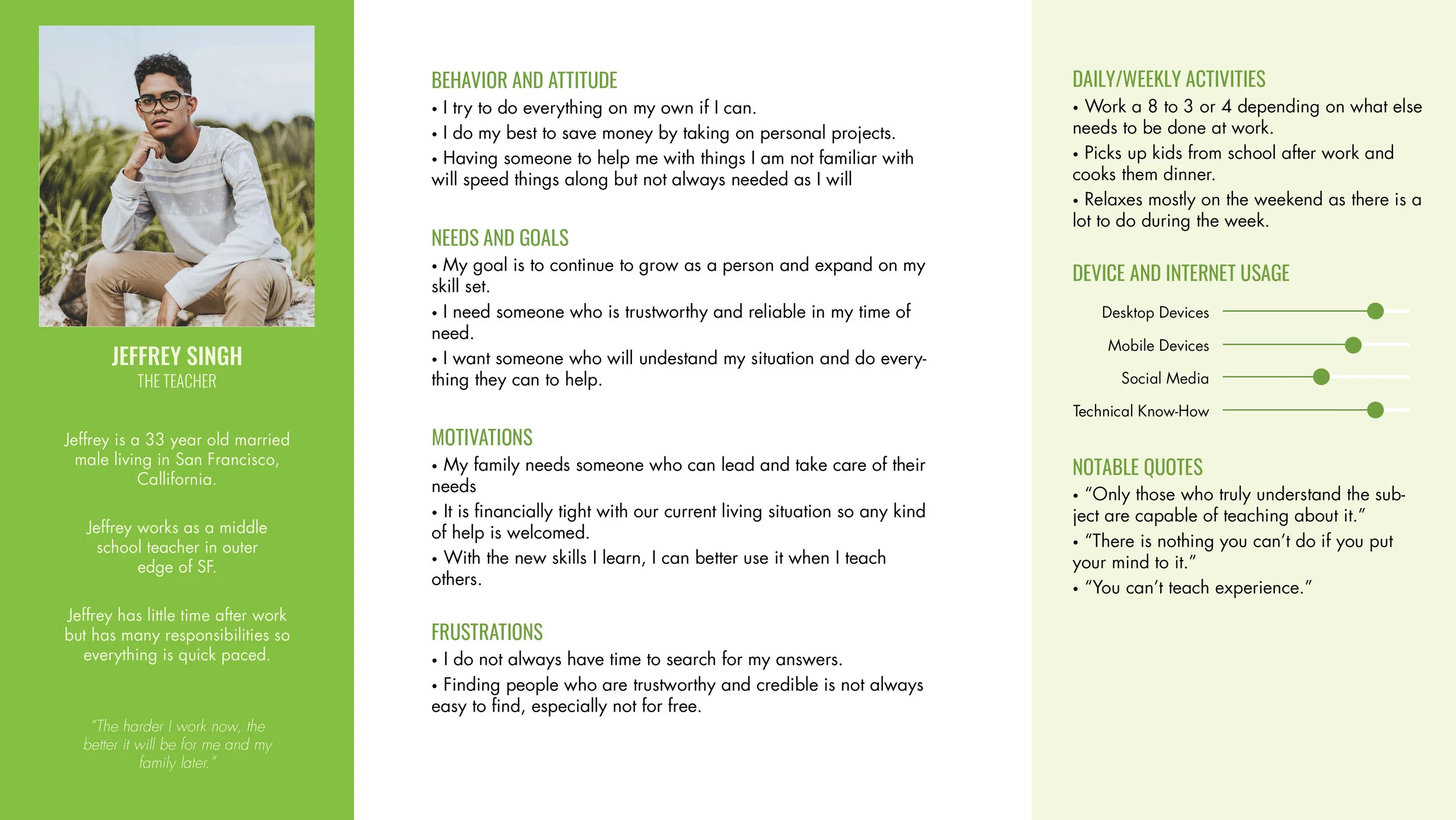
After the survey and interviews, I was able to collect all the data to create a persona. This is Jeffrey, a young teacher who lives in the Bay Area and loves to work on personal home projects. He loves to be hands on and focuses on self-improvement. By creating Jeffrey, I narrow down my audience to specific key points and can design more specifically to their needs and goals.
Scenario
Jeffrey loves to tackle new projects that comes to him. He knows that he is limited on time due to his busy schedule and knows that there are just somethings that he isn’t good at like building furniture or repair the cracks in the roof. He wants to have a platform where he can reliably trust and learn how to take on these projects without breaking the bank.
“Only those who truly understand the subject are capable of teaching about it.”
“You can’t teach experience.”
User
Flows
With my user persona established, I created user flows to see how the user will potentially navigate through my app. I focused on the main function of find an expert and booking an appointment. This allowed me to flush out all the potential screens and routes the user would go through to reach their goal of finding help.
Prototyping
After identifying the user and the flow they will take, I created each screen starting with sketches, to high-fidelity prototypes. Throughout the process, I tested the prototypes on 5 participants with ages ranging from 24 to 30. I provided them with different task and scenario task which provided me on insight into the current functionality of my design. From there, I made changes and adjustments.
Wireframes
& Low-Fidelity
From different ideas and sketches, I created wireframes of the pages the user would need to navigate to their goal of finding an expert. I tried many different layouts and compositions drawing from different inspirations like Pinterest. The wireframes were rough but provided a good foundation and direction for the app.
Mid-Fidelity
The mid-fidelity prototype was created using Adobe XD and they took the wireframes and made it more refined. Even though the app was not completed yet, this added some life into it. Most text and images had not been added in but the mid-fidelity prototype provided a good idea of how the app would work and how the elements would interact.
High-Fidelity
In my high-fidelity prototype, I was able to incorporate most text and certain images to make the app feel more developed. Colors were not yet added into the app because I wanted to focus on the composition and the functionality of the app without distracting factors. At this point, most of the apps functionalities was flushed out including the search, messaging, and quick help feature. All would benefit the user with finding what they needed.
Final
Mock-Ups
Even after creating the high-fidelity prototype, a few more iterations of the design were created as more testing was done and more changes were made. Layouts were changes, buttons shifted, even more detail was added to provide users with a real experience. I continued to test after for certain features like the booking appoint and the home page.
If you haven’t yet, check out my
High-Fidelity Prototype
Style Guide
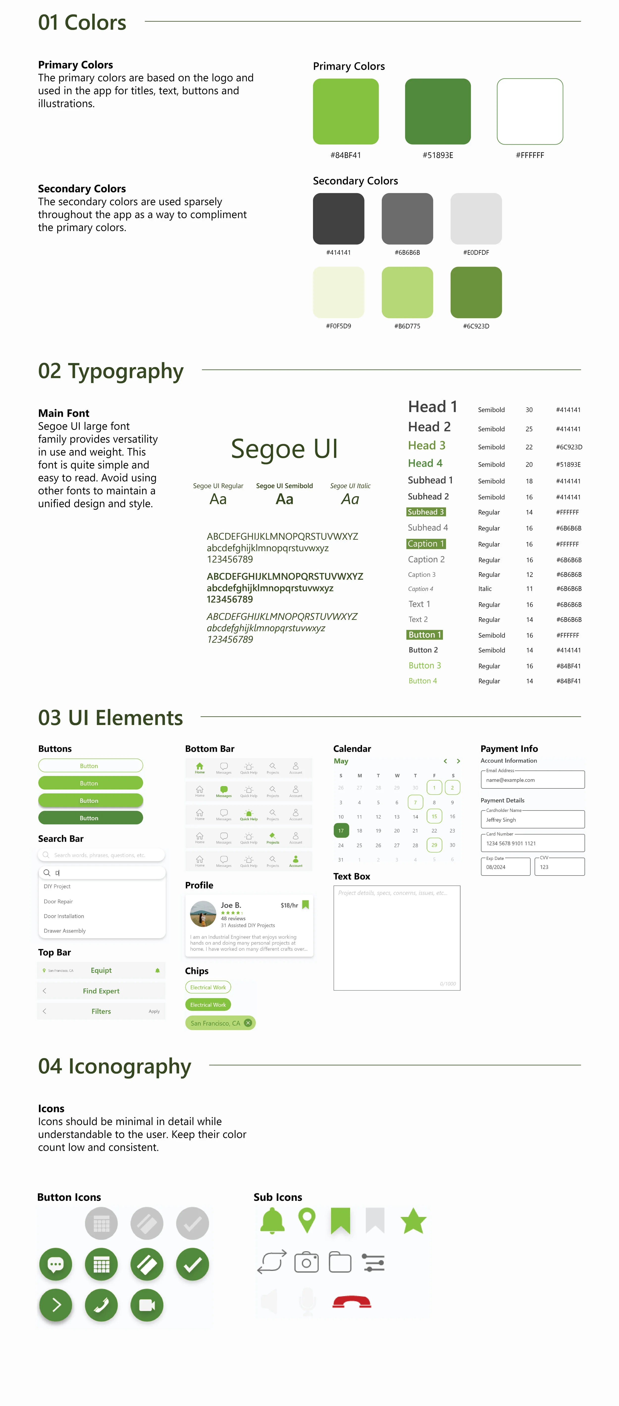
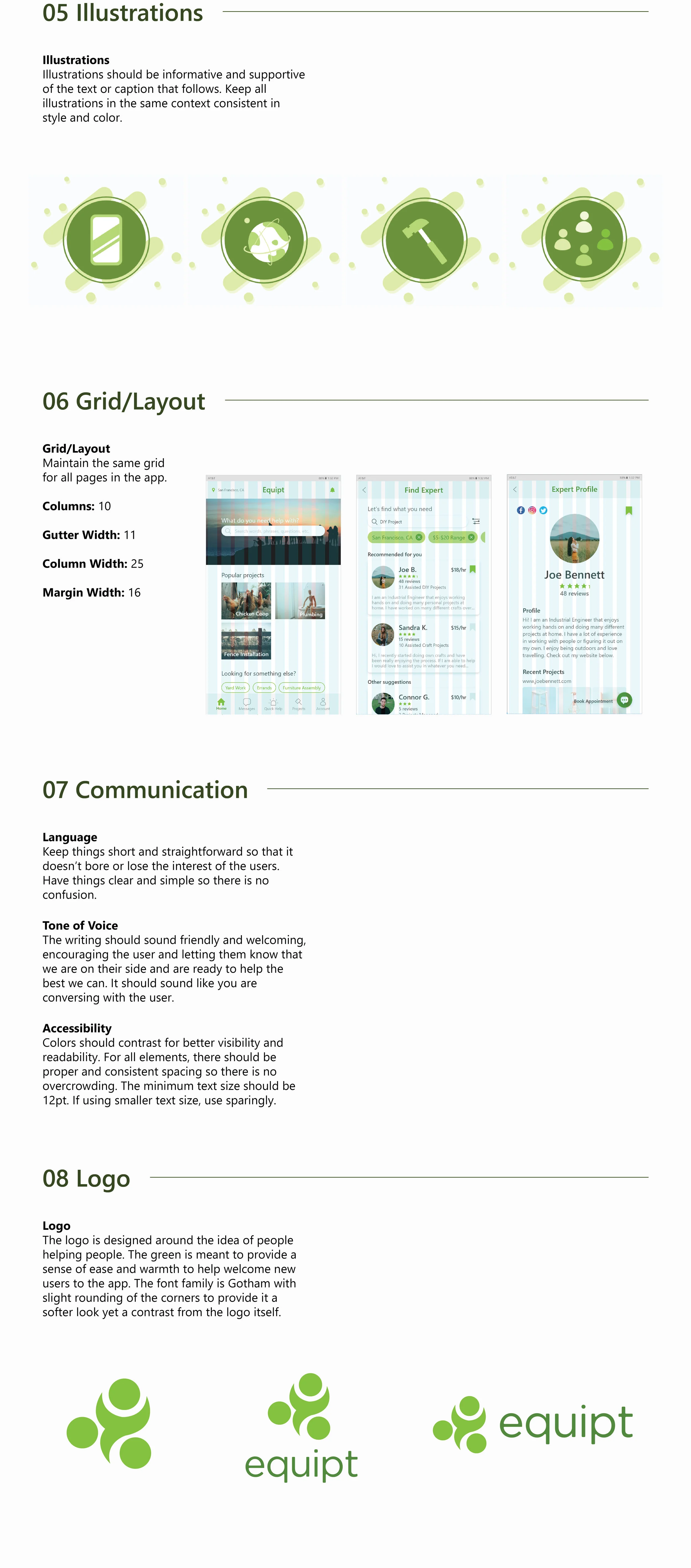
To better help those who will work with me on this project in the future, I developed a style guide so there it is clear and constant idea of what the design style should be if there is future deveolpment.
Final Thoughts & Reflection
Though the design process never really ends, this app process has come to an end. With some final adjustments and dimension changes I am happy with the work I put in. The process of learning and understanding the user, then designing with them in mind is something that I continue to learn and work on as it is easy to get caught up in making the design your own instead of focusing on the user. Some take-aways for this project:
What went well? I felt that the user research for this project was more in-depth as I was able to do both user surveys and testing which provided both quantitative and qualitative date. That allow for a more concise user persona.
What didn’t go well? The testing of the prototypes were difficult as the participants that were using the app were initially confused about certain design choices and functions.
What could be better? Continuing the iterate on the prototypes could provide better results. There is potential to add in animations to make the app more fluid.
The end result is something I think users would be able to take advantage of and use to better their lives when there are things that get too difficult. You can never be too prepared and the unexpected is bound to happen to the best of us. So let us “equipt” ourselves with the tools we need to tackle life to the best of our abilities.
