Investing Made Simple
Role | UX Designer
Duration | Two Months
Tools | Figma, Adobe XD, Adobe Illustrator
As a second project for my CareerFoundry UX Design course, I was able to create my own app for investing. I wanted to create a platform where users can trade and research stocks easily. There was a focus on the functionality and flow of the investing process to hopefully encourage new users to be proactive in their savings. As a person who is familiar with investing, I like having easy to use platforms that do not overwhelm the users with so many options. The idea of Spurt was inspired by the quick and easiness of what investing can be.
If you haven’t, check out my
High-Fidelity Prototype
Competitive
Analysis
To start my design, I began with understand who the main competitors were in this space. There are many trading platforms out there for users to use so I decided on choosing ones I thought would appeal to the younger generation as they would be more likely to be using investing apps as their main trading platform. Both Robinhood and M1 Finance were two platforms that stood out to me because they both did trading but their focus was different. These companies would be a good start to better understand the industry I was trying to design for the the users that will be involved.
User Research
& User Persona
Investing has become more prominent today than ever before. As companies make investing more accessible, new investors flock to brokers and apps to grow their savings. There are many though that still find investing something difficult to begin, daunting even. Spurt was designed for those who are new and trying to get started.
In order to know who I should be designing for, some user interviews needed to be conducted. The interview consisted of 11 questions related to the participants investment experience and their involvement with investment type apps. 5 participants we interviewed ranging from 20 to 30 years old. Some important findings from the interview were:
80% of the participants have some form of experience with investing and investment apps. 20% had no experience or interest in investing.
60% of the participants used traditional brokers (Charles Schwab, Bank of America, Fidelity, etc.), 20% used a mobile app (Robinhood), and 20% used both.
All of the participants said they pick their own stocks to invest into.
Most of the participants found simplicity and usability to be one of the major reasons for using the platform they did.
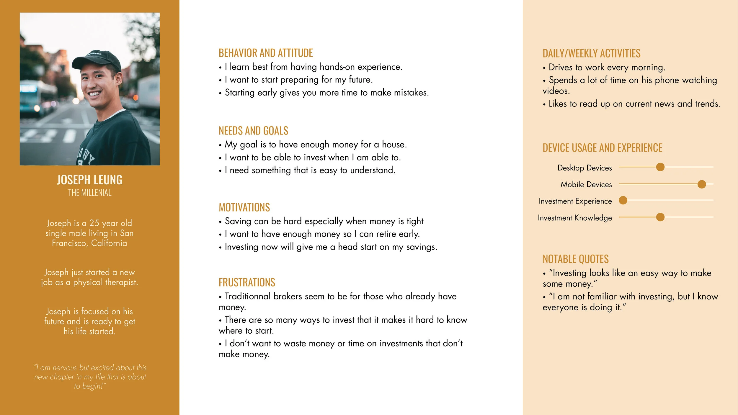
From the data collected in the interviews, I was able to develop a persona based on the needs of the user. Meet Joseph, a young chinese male who works in the Bay Area. He has just started working his job as a physical therapist. He is trying to start saving early through investing.
Scenario
Joseph wants to start saving for retirement but is not sure where or how to start. He has seen videos and has knowledge of what investing is about but has not experience with and investment apps and online brokers. He wants something easy and simple to learn and gain experience in. He is busy as he just started at his job and wants to do his best so he is very focused on his job.
“Investing looks like an easy way to make some money.”
“I am not familiar with investing, but I know everyone is doing it.”
User
Flows
Task Analysis
After understanding who I was designing for, I created a user flow to understand what screens needed to be developed based on the task the user will be doing. For the app, there will be a focus on searching and executing trades. This would mean the user would need some way to get into the app, search for the stock they want, and have a way to make the trade. Creating this flow allowed me to focus on screens needed for the app to properly function.
Task:
To trade a stock
Entry Point:
Logging in or Signing up
Success Criteria:
Confirm trade and return home
Prototyping
After identifying the user and the flow they will take, I created each screen starting with sketches, to high-fidelity prototypes. Throughout the process, I tested the prototypes on 2 to 3 participants with ages ranging from 20 to 30. I had them do simple task like navigating to the research screen in order to learn more about how they interact with the app and how to improve on the functionality.
Wireframes
& Low-Fidelity
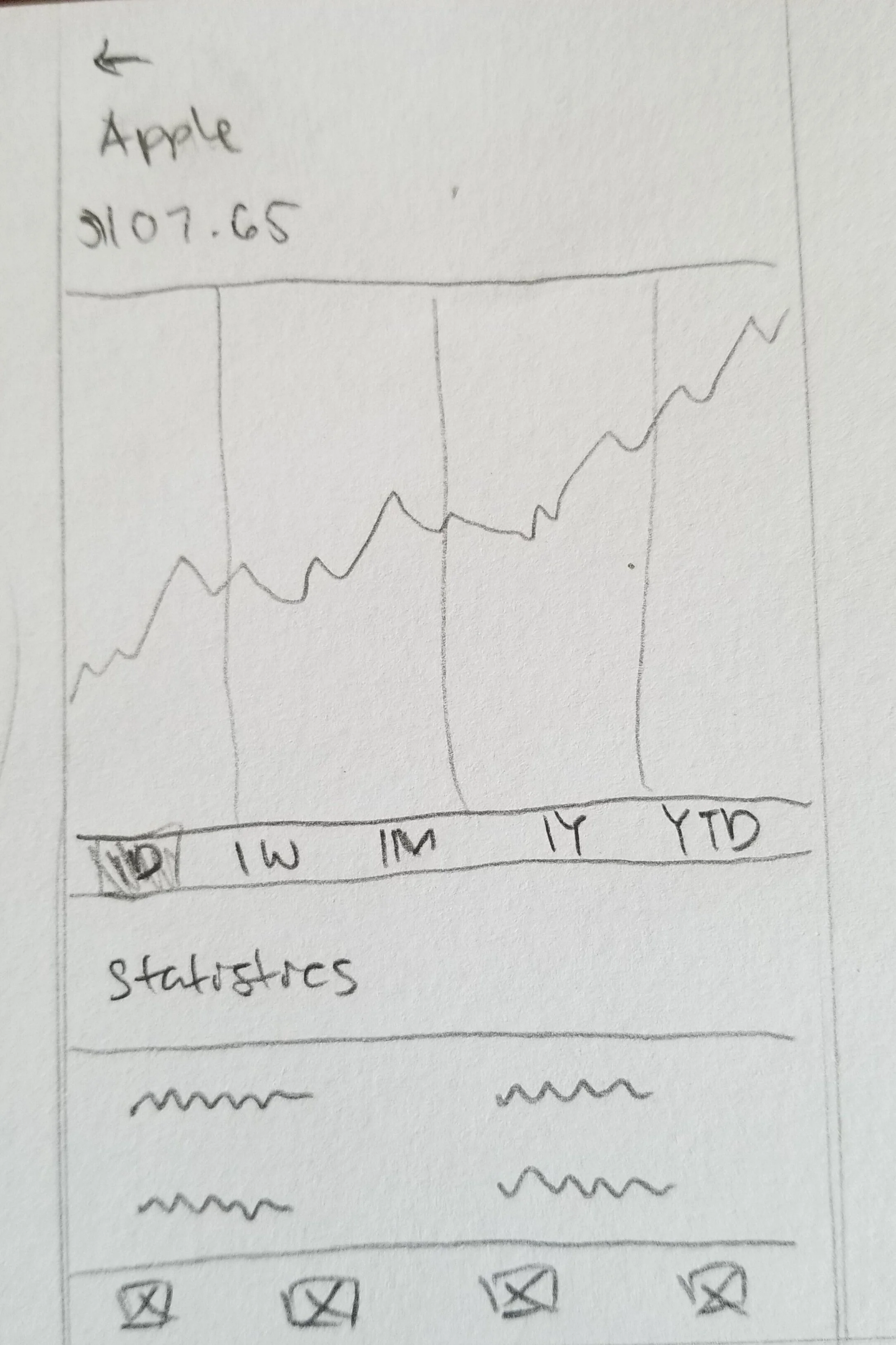
I started my prototyping process with sketches I created based on the screens I knew the user would need. This included a login screen, home screen, stock profile screen, and research screen. I took some time to sketch out all the possible ideas and variations of the screens and chose the ones I thought fit the users needs the best.
Mid-Fidelity
For the mid-fidelity prototypes, I cleaned up the wireframes I made with just enough detail for the user to understand what they were looking at. I then had the screens tested on participants to get a good idea of what their initial thoughts and experiences were. This gave me a good opportunity to learn what they were expecting from the app and what they wanted.
High-Fidelity
In the high-fidelity, more testing was done with great success. Most users understood where they were at and where they were heading. There were still changes needed to be made and iterated on but the based on the participants feedback, I was on the right track.
Final
Mock-Ups
There will always be room for improvement and new features to implement but for the project I was working on, this was final result. I made changes to the layout to follow the Android design guidelines and also provided and light and dark theme which was something mentioned from the participants in the test.
If you haven’t, check out my
High-Fidelity Prototype
Final Thoughts & Reflection
Creating this app was quite enjoyable not only because, I am a fellow investor myself, but because of how I was able to have a hand in every step of the process. This project challenged me to create something that I would be comfortable using on top of my target audience. Being able to know who the competition was and what they were doing allowed for a better understand for what can be done better. On top of that, testing early and often created continuous changes and iterations that resulted in Spurt.
What went well? The process went quite smoothly, especially the testing. Participants that volunteered provided insightful feedback throughout the process that aided in the iterations and design changes of the final design.
What didn’t go well? Poorly drawn wireframes and sketches made it difficult to test the initial design on users as it was too difficult to understand what they were looking at and what it was designed for.
What could be better? Diving deeper into the competition to identify what could be done to stand out and be more effective would be helpful in creating something unique.
Though the project has reached a conclusion, it doesn’t mean there can’t be more added to it. For potential features, this app can also include how the user will navigate through different accounts, providing a history of recent activities and trades, and also what the app could look like when trading with options.


